Wednesday, June 22, 2011

GitHub for Mac launched

GitHub for Mac launched

Surprising and delightful. They didn’t even bother to mention the lack of a Windows or Linux client - as if the reason for the absence of such was already obvious to members of their community.

It even works with non-GitHub repositories, although with some limitations1.

I love the idea that it has near-automatic sync with the web site, abstracting away details like push and pull. This is one of the first things new users to Git have trouble with: they clone a repository, make some changes, commit and push, only to be rejected with a ‘non-fast-forward’ error because someone pushed commits in the meantime. So they pull, which by (stupid) default, does a fetch-and-merge, making a horrible mess of the timeline2. Thus they have to learn to ‘git pull –rebase && git push’ every time they want to push - a needless amount of busywork to bother the user with. If only the command-line had a ‘git sync’ command that did this automatically.3

GitHub for Mac also has an automatic behind-the-scenes stashing action when you switch branches, which I’ve always found was how users new to Git expected switching branches to work4.

It is a bit curious that they used Chameleon, a library for easily porting iOS apps to Mac, when no such iOS app yet exists; but I won’t begrudge them that. But on a related note, I can’t help but notice that the app is very iOS-like, in that it has copious animations, and generally only shows one thing in the window at a time. This is a frequent complaint of mine in Git GUIs, even otherwise-nice ones like Gitbox: I’m used to being able to easily flick through diffs of commits with a minimal number of clicks or key presses. With GitX, my current (but sadly, apparently no longer maintained) GUI of choice, this is done via a split view, where I select a commit in the top list box, and the diff is immediately shown in the bottom; with GitHub for Mac, I have to double-click, and the list of commits is replaced with the diff; Gitbox doesn’t display diffs on its own at all, instead launching FileMerge, which comes with Apple’s developer tools5.

But the biggest thing keeping me from using it is the lack of a stage6; maybe if I were a new user to Git, this wouldn’t bother me, but I’ve become so used to the power of being able to commit only certain changes from a particular file - to shuffle changes back and forth across the stage in order to break things up into separate commits as I change my mind about what I need to do in the middle of my work - that I can’t do without it.

So for now, I suppose I will have to stick with GitX. But I eagerly await an actively-maintained replacement that will improve upon it7. Maybe, eventually, that will be GitHub for Mac. And of course, I continue to use the command line, grudgingly, for things that GitX doesn’t do. While there is unlikely to ever be a GUI app that does it all8, an app like GitHub for Mac seems like it might be able to reach 90% of use cases for most people. That in mind, I will certainly recommend it to new users, even over GitX, and I’m sure GitHub itself will be promoting it. Given the popularity of GitHub, I could see it quickly becoming the most popular version control client anywhere.

This post was written too quickly and tiredly, doesn’t flow well and has way too many footnotes. Bah.


  1. For example, it will only work with a single remote. This seems acceptable, as it is by far the most common use case; people I teach about Git (mostly Subversion converts) are invariably surprised to learn that more than one remote is possible. ↩︎

  2. When I set up a Git server, I use an update hook I adapted from the GNOME repository, which refuses a push that contains a merge-pull. It causes a lot of short-term pain, but in the long term it reduces confusion. It also causes angst about having to remember to use the ’–rebase’ switch with pull, but the way to make that work as the default for all branches is so ridiculously convoluted that I don’t bother explaining it. ↩︎

  3. Yes, I know you could make an alias to do it. Most users never will, nor should they have to. Software should address the most common use cases out of the box. ↩︎

  4. The Git core team, which develops the command-line, is notoriously insensitive to requests for usability improvement. There is potentially an entire separate post about how dysfunctional it is. For an example, see this mailing list thread. I will also take this time to flaunt my exchange with Wil Shipley about it on Twitter: [1] [2] [3] (Yes, I felt very special indeed.) ↩︎

  5. This seems like such an obvious omission that I can’t help but think that a built-in diff viewer will appear in Gitbox soon. Perhaps at that time, I will give it another look. However, I can see how programming a diff view could be a difficult project to undertake. ↩︎

  6. As noted in the thread from the earlier footnote, the ‘stage’ concept technically does not exist in Git itself. Regardless, it’s based on concepts from the command-line program, and most other GUI clients offer it - with the notable exception of Xcode 4. ↩︎

  7. I’ve only mentioned a few GUI clients in this post, but I’ve tried most if not all of the ones currently available for Mac. ↩︎

  8. Even though the awful official Git GUI does try. ↩︎

Tuesday, June 21, 2011

A Surprising Advantage of Vinyl

A Surprising Advantage of Vinyl

It depends on the album; for some releases, different mastering engineers are actually assigned for the vinyl release vs. the CD release. For others, it’s the same recording on both mediums. Research them on an individual basis before proclaiming one or the other is superior.

Wednesday, June 8, 2011

Nintendo demo reel of Wii U games were actually Xbox 360 and PS3 versions

Nintendo demo reel of Wii U games were actually Xbox 360 and PS3 versions

I know bullshot is ubiquitous in the industry, but… aw geez, Nintendo.

Wednesday, June 8, 2011

no title

Legend of Zelda: Skyward Sword - E3 2011: Official Trailer

It’s in vogue for business analysts to poke fun at Nintendo for getting market share stolen by Apple, but we won’t be seeing anything close to this on an Apple device any time soon.

Long-time Apple users should know that it’s not market share that matters.

It’s the software, stupid.

Thursday, June 2, 2011

Apple tries to put the kibosh on iPad and iPhone giveaways

Apple tries to put the kibosh on iPad and iPhone giveaways

Really strange article on CNN; makes very little sense.

In our legal system, there is something called the First-Sale Doctrine which basically says that once you buy something, you can sell or give it away however you want.

An argument could be made that contest promoters can’t use Apple’s trademarks without authorisation, but that rings false to me as well; that would make it basically impossible for anyone to sell anything, ever. By the same argument, General Motors could end the market for used cars instantly if they wanted to, because no-one could ever describe what they’re selling in an advertisement, and no-one would buy a car without knowing what it was1. I don’t think so. Our legal system is bad, but it’s not bad.

Even Apple itself refers to these ‘rules’ (author’s term) as mere ‘guidelines’ (actual term). Apple isn’t known for being sloppy with language. Do you think they’d give that name to something they believe has the power of law standing behind it?

Apple could, in theory, refuse to sell iPads to companies they think are aren’t going to abide by their guidelines, but that would be pointless when you can just pick one up at your local Target, no questions asked.

One of my pet peeves is when a journalist allows very obvious incongruities to pass without comment. Doubly so when it’s from a person or organisation that is commonly seen as reliable.2

And it will annoy me further when the blogs start to mindlessly repeat it, as blogs do. In fact, they already have.


  1. Yes, this is your terrible car analogy for the day. You’re welcome. ↩︎

  2. This is all relative in the news business, of course. ↩︎

Thursday, May 26, 2011

A clearer installer dialog

The root of the problem with ‘scareware’ like Mac Defender is the ability of the evil software to convince the user of something that’s not true. In this case, the software convinces the user that it is Apple (instead of a scammer trying to steal their credit card), and that they have been infected by one or more viruses (they have not), and that they need to follow the software’s instructions to solve the problem (in actuality, following the instructions causes a new problem instead of solving a non-existant one).

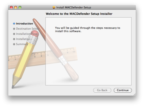
Users are used to ignoring dialogs filled with screens of vaguely-worded text if they already have an idea in their mind that they urgently need to do something (such as print a report, see this funny thing their friend just sent them, or rid their beloved computer of an evil threat). So when they see something like this, may not quite register that anything is odd:

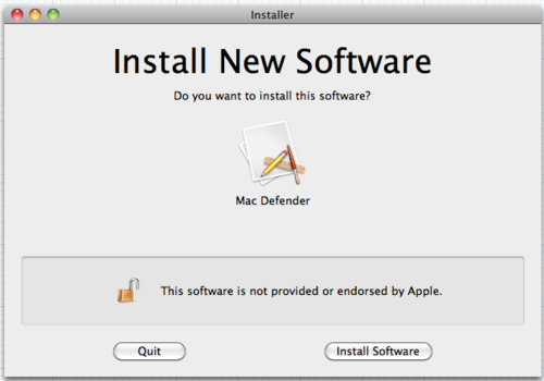
I think something more like this1 could go a long way in helping to quickly dispel the notion that faked downloads have anything to do with Apple, their computer, or a real threat, while minimally intruding upon legitimate software or ease of use:

The ‘unlocked’ icon and message would appear when the installer isn’t digitally signed. Signing is already present in Mac OS X and has been for several versions, although it’s mostly unused.

You’ll notice that there is no language present that attempts to caution or warn the user, such as ‘this may harm your computer’ or ‘beware of scary untrusted bad guys out there’. This is a very important and intentional omission. My theory is that such messages are not effective in motivating real user education about security threats, only in instilling in people a vague and constant fear that something bad might happen which they have little or no control over - which is the precise sort of perverse motivation that leads to these types of scams succeeding in the first place.

I also believe, as clearly does Apple2, that simply making the installation process harder to complete successfully (by requiring additional, annoying actions3) is not an acceptable solution either. For one thing, annoying the user will only desensitise them and make them pay less attention in the future; for another, security and usability are often at odds, and a delicate balance must be struck between them. Throwing usability out the window in favour of security is unacceptable unless it is absolutely the only possible option; very rarely are people who make that decision qualified to do so.

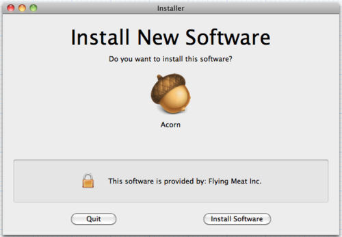
To address the Happy Path: if the installer is signed, this would be shown instead:

Of course, one possible phishing vector is the company name, which I’ve seen exploited in the past on SSL certificates. Perhaps the solution here is that whoever signs the certificates makes sure it’s a registered corporation or verified individual’s name; perhaps the certificates even have to come from Apple itself. There are a few ways that it could be done, but it seems like the risk could be mitigated.

Gruber alluded that another potential solution would be for Apple to only allow installations from the Mac App Store in future versions of Mac OS X. Or less drastically, there could simply be a checkbox somewhere in System Preferences that ‘power users’ can check to allow installing non-App Store apps. Perhaps I’m naive or idealistic - although I could live with that, I would rather that non-App Store apps didn’t become second-class citizens. Sadly, I suspect that is already beginning to happen.

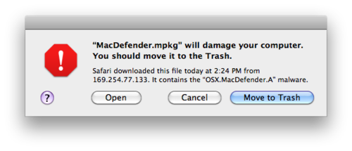
Update 2011-05-31: I wanted to clarify a point, now that Apple has updated Mac OS X to show this dialog for Mac Defender:

This dialog has already been present, for other specific types of malware, since 10.6.0.

It does indeed contain ‘scary’ language about being harmful. However, this is in response to a specific, known threat, and is phrased assertively rather than vaguely; in my original post, I was making an implicit comparison to warnings that appear on Microsoft Windows whenever you run any unsigned executable, whether it is known to be ‘bad’ or not. I have no problem with targeted warnings that appear only in direct response to a specific threat and default to what is almost certainly the right choice; what I have a problem with is vague warnings that appear seemingly randomly and interfere with the normal expected functioning of the computer.


  1. Please excuse the hasty mockups. Thanks to Xcode and Acorn for making these incredibly easy to put together. ↩︎

  2. Look no further than the fact that the ‘Open “safe” files after downloading’ preference is still on by default in Safari after so many years. Which I don’t recommend leaving on, by the way. My idealism only goes so far. ↩︎

  3. The password prompt for administrator access is not there simply to be annoying and to stop and make you think, although some consider it a side benefit; the prompt goes back a long way, to the OS’s UNIX roots in the 1970s. It’s actual purpose is to ensure that the person who is sitting in front of the machine is actually authorised to perform that action - not just to guard against other users, but also things such as rogue script designed to press enter at the appropriate times. This is one thing Microsoft critically misunderstood when trying to copy it in the form of UAC, and turning it into a simple ‘OK/Cancel’ prompt. ↩︎

Thursday, May 26, 2011

'Don't run as the admin user' on Mac OS X

I’ve been hearing this advice repeated a lot since the Mac Defender stuff has broken out, mainly from Windows users/sysadmins. Since this is (or used to be) good advice on the Windows platform, they reason that it should apply anywhere.

The only thing that ‘being the admin user’ on the Mac gets you is the ability to make changes to common, non-system areas. For example: it allows you to place new files or software in the /Applications or /Library folders, without entering a password.

What it does not do is allow you to arbitrarily make changes to /System or other areas that are owned by root; those will still require a prompt for your password. That’s why Software Update, or installers that have to place things outside of /Applications, require your password even when you are an admin user.

Creating a new user account without admin permission, using it for day-to-day stuff, and entering your (other) admin user account’s name and password whenever you need to do something administrative, does not get you any additional security. Assuming you are the person who administers your own machine, you’ll just get the same password prompt that you would get even if you were an admin.

True, it will mean that you will now have to enter a password to drag stuff into /Applications. But it doesn’t mean you have to enter a password to install software; on the Mac (or even on Windows), you can just as easily install and run the software from any location on your hard disk, such as your home folder. Not only would this be trivial for malware to adapt to, it’s what Mac Defender is already doing.

There is one situation where I can see it might be useful: if you’re setting up a Mac for your parents1 or someone else whom you don’t trust to make educated administrative decisions. You could give them a non-admin account, set up a separate admin account and don’t give them the password. However, obviously if you do this, you also take on the considerable responsibility of administering their computer for them in perpetuity2, which is not something to be taken lightly.

But if you’re the admin of your own Mac, there’s not much benefit to running as a user that doesn’t have admin permission.


  1. In the latest episode of The Talk Show, Gruber claims that the name of the ‘Parental Controls’ pane in System Preferences is an in-joke with a double meaning amongst Apple employees; that most people think it’s there for parents to control their children, but it’s actually more useful for adults to keep their parents out of trouble. ↩︎

  2. Otherwise, they’ll never be able to run Software Update, even if they wanted to, and a remote privilege escalation exploit is going to come along someday and the machine won’t be protected. You’ve possibly made the machine even less secure than it was. ↩︎

Friday, May 20, 2011

no title

</embed>

Steve Jobs Introduces the Apple Store (2001) (by vintagemacmuseum)

Every single one of them is connected to the internet!

And the red ‘hotline’ phone like in the Oval Office - great. Too bad they don’t still have that.

Also: Cabel at the grand opening

The Apple Store didn’t make its way to Rochester, NY until many years later, so the wooden-tables Apple Store is the only one I remember. I did buy a few things there back when you still had to walk to a cash register at the back of the store. I still think I prefer that - never did get used to having to flag someone down and awkwardly wait while their iPod Touch (previously, a Windows CE device) completes the transaction.

Thursday, May 12, 2011

You fix it, you bought it

VUPEN said they found and successfully exploited a ‘zero-day’ (not previously known) vulnerability that defeated Chrome’s reputable ‘sandbox’ security model.

Google said Chrome was not hacked and was not vulnerable; instead, it was a problem with the Adobe Flash plugin, which is included with every Chrome install.

Gruber said, along with many others, that because Google bundles Flash with Chrome, even though Google did not write the insecure software (Flash) and cannot fix the insecure software (Flash), they still are responsible for the problem because they included it with Chrome.1

Google engineer Chris Evans said the reason Google bundles Flash with Chrome is because most users already have Flash installed, but the version they have installed is, more often than not, an old and outdated version of Flash, presumably containing more security problems than the latest version. Therefore, even if the latest version has problems (or is likely to have problems in the future), bundling it is still likely to improve the situation for most people.

Let’s assume for the sake of argument that Evans’s explanation is Google’s motivation for bundling Flash2.

People like me who have some semblance of knowledge about ‘computer stuff’ are familiar with the problem of helping relatives with their computer issues:

If you help them fix it, they’ll call you the next time it breaks again. And again. And again.

You can try to explain the reasons they got themselves into that mess: they clicked dodgy attachments, they installed smiley packs, or they simply continued to use a machine with Windows on it. But it won’t make any difference; by continuing to help them, you continue to enable their bad habits that continue to lead to problems, and they come to depend on you.

Google says that bundling Flash is better than doing nothing, but there is one other thing they could do:

Block Flash in Chrome by default.3 Move YouTube to HTML5. The world would follow.

(No, I don’t really expect this to happen anytime soon.)

Update 2011-05-25: I recently found out, completely by accident, that Chrome actually has a built-in option to do what I suggested; it’s just off by default. Here’s how to turn it on:

  1. Navigate to about:flags
  2. Find ‘Click to play’ on the page, and click ‘Enable’. Oddly, this does not actually enable the feature, it only enables another option which you can use to enable the feature.
  3. Restart Chrome.
  4. Open Preferences.4
  5. Click ‘Under the Hood’.5
  6. Click ‘Content Settings’.
  7. Finally, next to Plug-Ins, select ‘Click to play’.

  1. This reflects Gruber’s reasoning for why Apple has never included Flash on the iPhone or iPad, and no longer includes it on new Macs: it is beyond Apple’s power to fix when things go wrong; and Flash has a history of things going wrong, especially on their platform. ↩︎

  2. And not, say, because it gives them a claimed competitive advantage in certain markets against a certain competitor who refuses to have anything to do with Flash as of late. ↩︎

  3. It doesn’t even have to be as extreme as Apple’s prohibition. Simply putting the Flash content behind an overlay that says ‘click to display insecure content’ should do the trick. Most sites’ video content is already in h.264; they just need a little nudge. It’s sad how much the web depends on a plugin it doesn’t even need any more. ↩︎

  4. Ttry explaining this part to a novice computer user over the phone. On the Mac, Preferences can be found in the usual place. On Windows, you have to explain what the ‘wrench’ icon is and where to find it. But then, nothing works the same way as anything else on Windows. ↩︎

  5. Or if you’re using a Commonwealth English version, ‘Under the Bonnet’. Charming localisation. ↩︎

Monday, March 28, 2011

Folk Models of Home Computer Security (PDF)

Folk Models of Home Computer Security (PDF)

It’s always fascinating to me to learn about how ‘most people’ think about computers and technology.

If you find it too long, skip to section 2.1.

(Link is a PDF; here’s a Google HTML version.)

15 of 47