A clearer installer dialog
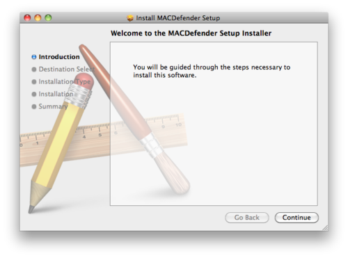
The root of the problem with ‘scareware’ like Mac Defender is the ability of the evil software to convince the user of something that’s not true. In this case, the software convinces the user that it is Apple (instead of a scammer trying to steal their credit card), and that they have been infected by one or more viruses (they have not), and that they need to follow the software’s instructions to solve the problem (in actuality, following the instructions causes a new problem instead of solving a non-existant one).
Users are used to ignoring dialogs filled with screens of vaguely-worded text if they already have an idea in their mind that they urgently need to do something (such as print a report, see this funny thing their friend just sent them, or rid their beloved computer of an evil threat). So when they see something like this, may not quite register that anything is odd:

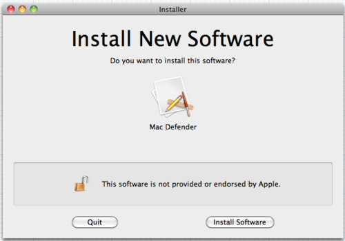
I think something more like this1 could go a long way in helping to quickly dispel the notion that faked downloads have anything to do with Apple, their computer, or a real threat, while minimally intruding upon legitimate software or ease of use:

The ‘unlocked’ icon and message would appear when the installer isn’t digitally signed. Signing is already present in Mac OS X and has been for several versions, although it’s mostly unused.
You’ll notice that there is no language present that attempts to caution or warn the user, such as ‘this may harm your computer’ or ‘beware of scary untrusted bad guys out there’. This is a very important and intentional omission. My theory is that such messages are not effective in motivating real user education about security threats, only in instilling in people a vague and constant fear that something bad might happen which they have little or no control over - which is the precise sort of perverse motivation that leads to these types of scams succeeding in the first place.
I also believe, as clearly does Apple2, that simply making the installation process harder to complete successfully (by requiring additional, annoying actions3) is not an acceptable solution either. For one thing, annoying the user will only desensitise them and make them pay less attention in the future; for another, security and usability are often at odds, and a delicate balance must be struck between them. Throwing usability out the window in favour of security is unacceptable unless it is absolutely the only possible option; very rarely are people who make that decision qualified to do so.
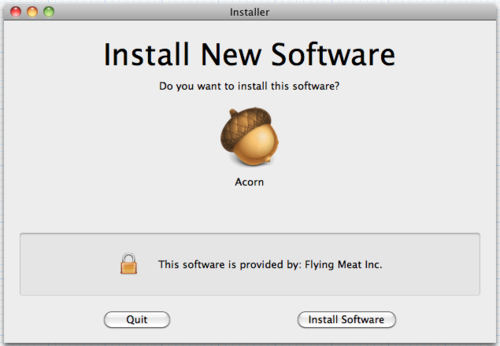
To address the Happy Path: if the installer is signed, this would be shown instead:

Of course, one possible phishing vector is the company name, which I’ve seen exploited in the past on SSL certificates. Perhaps the solution here is that whoever signs the certificates makes sure it’s a registered corporation or verified individual’s name; perhaps the certificates even have to come from Apple itself. There are a few ways that it could be done, but it seems like the risk could be mitigated.
Gruber alluded that another potential solution would be for Apple to only allow installations from the Mac App Store in future versions of Mac OS X. Or less drastically, there could simply be a checkbox somewhere in System Preferences that ‘power users’ can check to allow installing non-App Store apps. Perhaps I’m naive or idealistic - although I could live with that, I would rather that non-App Store apps didn’t become second-class citizens. Sadly, I suspect that is already beginning to happen.
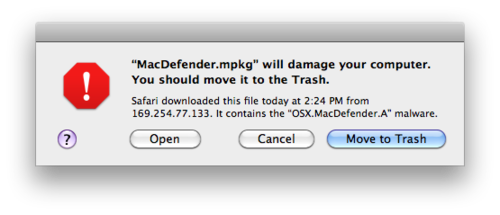
Update 2011-05-31: I wanted to clarify a point, now that Apple has updated Mac OS X to show this dialog for Mac Defender:

This dialog has already been present, for other specific types of malware, since 10.6.0.
It does indeed contain ‘scary’ language about being harmful. However, this is in response to a specific, known threat, and is phrased assertively rather than vaguely; in my original post, I was making an implicit comparison to warnings that appear on Microsoft Windows whenever you run any unsigned executable, whether it is known to be ‘bad’ or not. I have no problem with targeted warnings that appear only in direct response to a specific threat and default to what is almost certainly the right choice; what I have a problem with is vague warnings that appear seemingly randomly and interfere with the normal expected functioning of the computer.
-
Please excuse the hasty mockups. Thanks to Xcode and Acorn for making these incredibly easy to put together. ↩︎
-
Look no further than the fact that the ‘Open “safe” files after downloading’ preference is still on by default in Safari after so many years. Which I don’t recommend leaving on, by the way. My idealism only goes so far. ↩︎
-
The password prompt for administrator access is not there simply to be annoying and to stop and make you think, although some consider it a side benefit; the prompt goes back a long way, to the OS’s UNIX roots in the 1970s. It’s actual purpose is to ensure that the person who is sitting in front of the machine is actually authorised to perform that action - not just to guard against other users, but also things such as rogue script designed to press enter at the appropriate times. This is one thing Microsoft critically misunderstood when trying to copy it in the form of UAC, and turning it into a simple ‘OK/Cancel’ prompt. ↩︎
